
85. VILHELM HAMMERSØI: A SPACE BETWEEN ABSENCE AND PRESENCE.
FREIZE MASTERS 2024

Vilhelm Hammershøi, Interior in London, Brunswick Square, 1912, Oil on canvas, 53 x 76 cm / 20 7/8 x 29 7/8 in.
‘I have always thought there was such beauty about a room even though there weren’t any people in it, perhaps precisely when there weren’t any.’
V.H.
84: OSCAR MURILLO: A SPACE BETWEEN COLLAPSE AND SPIRIT.
Oscar Murillo: A balancing act between collapse and spirit. David Zwirner - LONDON.

Oscar Murillo, manifestation, (detail) 2023-2024. Oil, oil stick, spray paint, dirt and graphite on canvas. 260 x 280 cm.
To bodily scrawl as if in a state of emergency - to repeat again and again - to layer until a surface of scraped screams fill the continuum as whole - to void a space to riot - en-packeted to silence burns to a cacophony of such zigzagged momentum - to form a cage of allowance versus release.
With controlled speed as to abandon the waxed reverb of declaration - to repeat in obsessive searching - a state of bleeding of the scarred fields of despair.
To render remembrance of what it held within as to condense from a bruising to bursting - of the chaos over the calm, of the repeated over resilience - in the throwing, throbbing of the raw - held up in the tradition of its own revolt.

Oscar Murillo, Telegram, 2013-2014. Oil stick, ballpoint pen, fountain pen, felt tip pen, highlighter pen, permanent marker, paint, crayon, staples, natural pigments, debris and other mixed media on canvas. 34 x 47.5cm.
Morillo rings loud his porous declarations - his flamed manifestos of now or never - a mapped - human alarm call with every fierce rendered arrow - and then to return, with tender whispers that love is life.

Oscar Murillo, manifestation, 2023-2024. Oil, oil stick, spray paint, dirt and graphite on canvas. 260 x 280 cm. Image courtesy of David Zwirner.
Oscar Murillo: A balancing act between collapse and spirit. David Zwirner - London. Until November 16, 2024.
Thank you Sara Chan and Niamh Brogan.
83. SHEELA GOWDA: A SPACE BETWEEN PASSIVITY AND HURTING.
The Imaginary Institution of India, barbican.
'A very insidious sort of violence...the needles hang at the end almost passively but they have the potential for hurting.’
S.G.

Sheela Gowda, Untitled, 1997/2007. Thread, pigment, needles. Edition 1/3. Private Collection.
A scrawled looping of ropes - back and forth as a winding - circling of growing commitment - to fray and unravel - as the story of a life - and the many lives of a self lived - loosened and freed - and yet to return as a collective reminder - a shadow twin - to double in concentration.

Sheela Gowda, Untitled, 1997/2007. Thread, pigment, needles. Edition 1/3. Private Collection.
The Imaginary Institution of India, Art 1975-1998. Barbican - Until 5 January 2025.
Thank you Georgia Holmes.
82. LE TRANG - A SPACE BETWEEN PAST AND PRESENT.

Le Trang, Self-Portrait, 2024, 42 x 48cm. Oil on Canvas, Private Collection.
A space between mother and self, between mauve and lilac and the life-giving greens of an imagined garden, forever in bloom - a place to return to even when far from home.
The focus of a subtle synthetism is vividly rich, with a knowing gaze set on the grandeur of the palatial and the luster of perception.
The first image I saw of your work was a double portrait in mauve - a photograph of you seated next to a painted depiction - there are certain shades of purple that return throughout your works - please can you contemplate your use of purple and why it is an important choice for you?
I was born and raised in Huế, the ancient capital of Vietnam. The color purple and the traditional áo dài in purple are symbols of my hometown.
To me, it represents the strength hidden behind gentleness—the qualities of a woman in the role of a mother. I emphasize the profound meaning of motherhood, the delicate balance between nurturing, caring for children, and a mother’s sense of self-worth. As a mother of three, I understand the pressures women face, having to maintain an image of grace while fulfilling their maternal duties.
When I saw the paintings in the real, my mind wandered to thoughts of the double portrait, and the idea of reimagining a self, what have you learned about yourself and what are the messages that you want to communicate through the creation of these works?
Similar to the meaning behind The Garden of Love (2024), this twin portrait explores and portrays the significance of combining the role of parenting with the elegance that comes from self-care and cultivating one's inner self.
I encourage young women to seek and accomplish their ambitions. Whatever their starting point, degree of education, or age, they should be confident in following their passions, despite the hurdles and problems that may come. The young woman in the artwork, immersed in her thoughts and desires, represents the fortitude to pursue her dreams and listen to her deep inner voice. All of the works in my MOTHERHOOD collection depict women who embody the delicate, distinctly Eastern, and deeply Vietnamese spirit.
There is a distinct sense of style connected to the 'Synthetism' movement within certain pieces, is there a connection to this movement within your practice and if so how do you see your work sitting within the landscape of painting?
Yes, my works indeed bear traces of the Synthetism movement. I am influenced by 19th-century French artists, particularly those of this movement, such as Paul Gauguin and Émile Bernard. I find the Synthetism style, with its simplified forms, bold colors, and symbolic representation, to be a remarkable way to convey deeper emotional and spiritual messages.
When portraying Vietnamese women figures, I blend this technique, by integrating Synthetism into my work, I aim to revive and reinterpret its spirit, creating a bridge between the past and the present.
Through this approach, I hope to imbue my paintings with a sense of harmony and emotional resonance, whether in serene landscapes or the elegant figures of women. This is how I honor the Synthetism tradition while also contributing my own voice to contemporary artistic dialogue.
I found your choice of frames to be intriguing, works made in modern times, framed to emulate another era, please can you contemplate your feelings towards the presentation of your practice?
A frame is not merely a decorative element; it is a symbol of the artist’s respect—both for the work itself and for those who engage with it. This respect extends to the space in which the artwork is displayed.
I am inspired by the exhibition standards of renowned museums worldwide, where frames are chosen to complement the artwork, elevating its story and presence. By framing my contemporary works in a style that echoes a bygone era, I aim to create a bridge between the past and the present.
This approach invites the viewer to engage with the work on multiple levels, harmonizing historical elements with the vivid immediacy of today’s visual experience.
At its core, the way I choose to frame my work reflects my deep commitment to presenting art in a manner that is both respectful, crafting an experience that captivates the eye while also stirring the emotions of those who behold it.
The portrait of the subject with a paintbrush in hand engaging with a surface that is out of viewers' sight fascinates me - please can you expand upon this work?
For me, the moment of painting holds a profound significance. It is a time when I completely retreat into my inner world, allowing myself to live authentically and true to my essence. That moment truly reflects my personal journey, both as an artist and a mother. Painting is the time where I can be entirely myself, diving deep into my soul, where I feel free to express my emotions and thoughts. In this self-portrait, I depict myself painting a weaver bird's nest—a symbol of 'home'—not only for birds but also for us, humans. Home is a place we all cherish. It’s where comfort, love, and belonging thrive.
This portrait, to me, is more than an image of an artist at work. It represents my thoughts and dedication to my family. It reflects the balance between my roles as an artist and a mother, creating a sense of home and comfort, not just in the painting but also in real life.
Through this painting, which reflects inner strength and the deep connection between family and art, I aim to affirm the power of feminism and the tremendous resilience of mothers. Mothers possess an infinite capacity to create, nurture, and inspire—not only within their families but also in their artistic creations. Creativity is not merely about producing works; it is the crystallization of love, devotion, and the delicate balance that the artist brings to life in their work.
A series of works by Le Trang were presented as a part of the exhibition ‘From The One To The Many’, Saatchi Gallery, London, September 2024.
81. MICHAEL CRAIG-MARTIN: A SPACE BETWEEN WITHIN AND WITHOUT.
Michael Craig-Martin, Royal Academy of Arts, London.

Michael Craig-Martin, Untitled (Black), 1989, Venitian Blinds.
A shadow square hovers -
beneath four pails - each holding a fullness still - as ropes taught - dart up to suspend a stage in silence.
As an abandoned accordion paused - its concertina left open - a box that never closes.
Graphed papers tessellate until a line is met - a frame of white - a boundary fort.
A tilted shelf - where 15 glass bottles lean - their multiple water lines form a single horizon -
An imagined ringing range of notes - to tap such bottles all in a row - as a xylophone made from what was there - what was saved.
As like Alice, beneath a glass table - looking up into the half-full. A shadow self - a cast illusion of a half-empty.
Untitled black, white and red blinds are pulled to close - but a window between is permanently open -
- As to view from within and not from without.

Michael Craig-Martin, Untitled (White), 1989, Venitian Blinds.
Michael Craig-Martin, Royal Academy of Arts, London. Until 10 December 2024.
Thank you Elena Davidson.
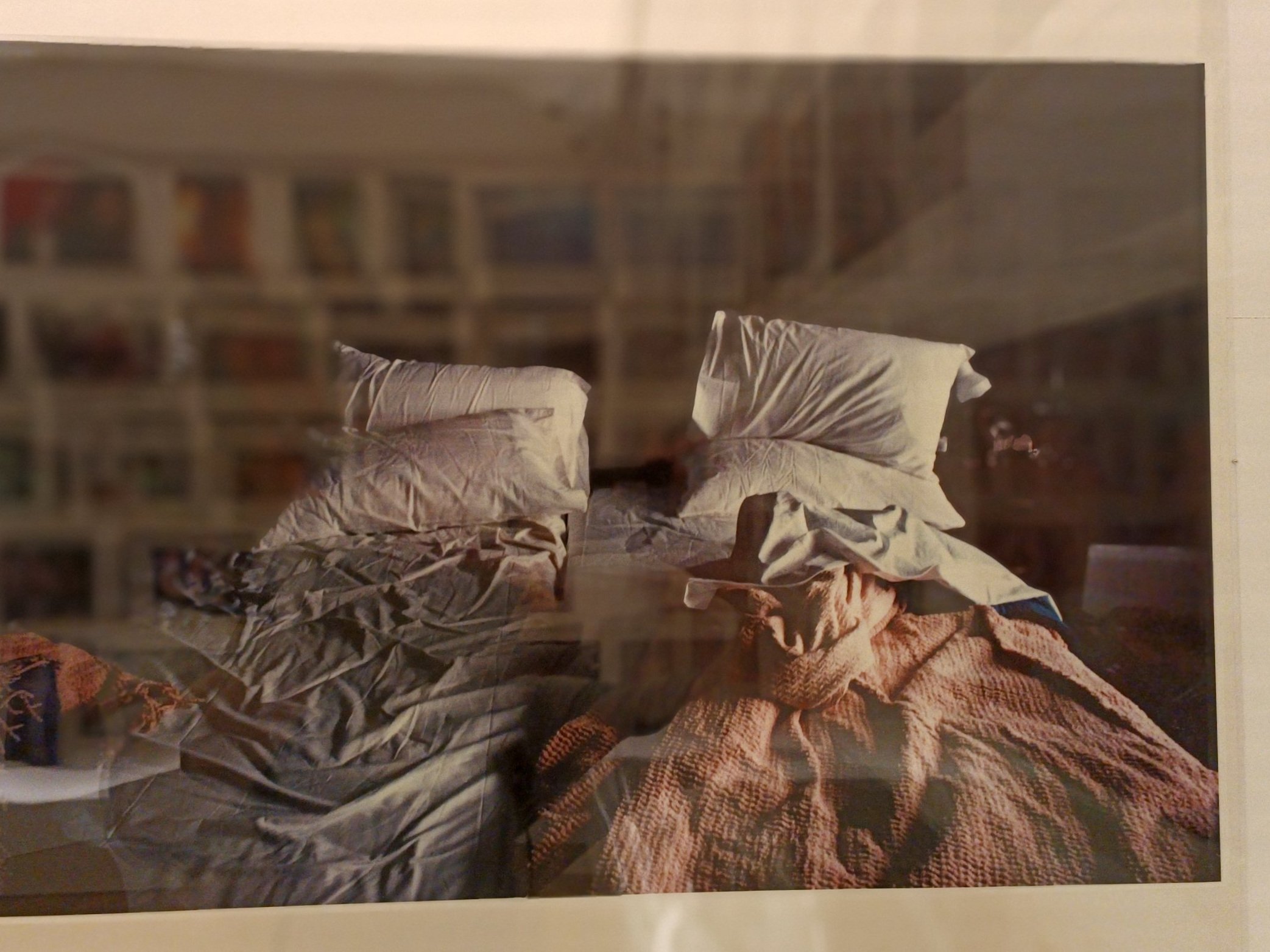
80. CY TWOMBLY - A SPACE BETWEEN THE FLEETING AND THE PERMANENT.
Cy Twombly - Fondazione Nicola Del Roscio - ROME.

Cy Twombly - Bed, New York 1951. © Fondazione Nicola Del Roscio. As seen in M-A (A SPACE BEWTEEN) issue 3, still life image by Harry Nathan.
The impulsive frames of intensity - protected from the fear of forgetting. To resurrect these fleeting memories of atmospheres past - to return in a heartbeat.
The romantic pull to document the momentary seems essential to Cy Twombly, in all media - the artist's expression in response to what feels like a personal search - a meditation. His photographs propose and possess privacy, to realise a truth exposed in plain sight and yet like a phantom these documents feel other-worldly. Media meld to form a painted poem tangibly tender and suspended - a mirrored impression recognised over stark realities - to watch the dappled time hover like fireflies to dissipate through blind windows.
A ready-made medium of the polaroid fascinates, how the immediacy of processing is readily available, originally created for industries that needed an immediate response, speed compromised over quality, and yet the eyes of the Artist appreciate the granular, tertiary tone of its palette, its ephemeral nature and its ability to somehow blur a reality with the ambiguous.
The object of an image that drops from its camera, which physically is divided by the hands and quietly, magically appears from a charcoal beginning, a blueish illusion ghostly silhouetted - haunting the mechanical before revealing its soul as if organic and yet physically synthetic. A poetry observed, even leaked as if a secret.
The distant relation to the pinhole camera, ceremonially presented with a magician's flourish, the polaroid loses none of its appeal in the excited fingers of a Black Mountain College alumni in Cy, whose images feel like the impulsive blushes of tender gazes later found between the pages of seismic novels.
Where the scent of the gloaming is inhaled as the melody of the night ebbs the landscape. As the impressionists astonished at the passing of light after the rain or how a breeze disrupts the haze of palpable heat, so too does Twombly reflect the wonder of time. Images taken as if for his eyes only, show the invisible nature of daily rituals and seasonal shifts, repeated so many times that they become more instinctive than inquiring, remind that the beauty of the present can be profound and often hold a permanence of melancholy which contradicts the ephemeral nature of fragile polaroid prints.
The rucked-up sheets of an empty bed, still warm from a dream - are grazed by the morning, a light that glows over surfaces as canyons and rests in momentary languid pools and enveloping shadow.
Eyes rest on forms as atmospheres - as sculptures of silence - as if for the first time - watched from the floor, where an impression of fruit, plate, and table become one, where pea pods become landscapes and a misty valley - a bruise on the page.
The blur of turning to hear a broken conversation or to see a room while dancing - A consciousness distracted by the sound of rain, a piano in another room, or a glimmering of light on a marble floor - where have I been?
—
Very special thanks to Nicola Del Roscio and Eleonora Di Erasmo - Fondazione Nicola Del Roscio.
A series of images by Cy Twombly are published within issue 3 of M-A (A SPACE BETWEEN, currently still available here along with 16 international stockists.
The M-A (A SPACE BETWEEN) contemplation and interview series will return in Autumn 2024. Thank you for reading.
79. NAN GOLDIN: A SPACE BETWEEN LOSS AND GROWTH.
Fragile Beauty, The Victoria and Albert Museum - LONDON.

Nan Goldin, Thanksgiving, 1973-1999. Cibachrome prints.
As flats of skin - scaled iridescent and gliding - as to unfurl from glistening - to slip simultaneously, as a seeded dandelion swathes a breeze, as a plume ushers a snuff of candled chorus - as to watch such bleeding impressions permeate to gold - as Caravaggio's Samson - shorn and sinking and Ophelia drowns in euphoric blisses.

Nan Goldin, Thanksgiving, 1973-1999. Cibachrome prints.
As to confess into a slipstream of admittance - a foaming - to flow as a torrent - and smash into open eyes as to be drunk at the wheel - embedded to crash - losing concentration - lucidity won.

Nan Goldin, Thanksgiving, 1973-1999. Cibachrome prints.
And with such tenderness - as drifting feathering of beats - passing by with a violence of continuing - of perpetual rhythms of an ongoing.

Nan Goldin, Thanksgiving, 1973-1999. Cibachrome prints.
To be halted - to be held up - to be dropped - to slump into sleep - to be bathed in a gloaming of evenings and the breaks between too late and too early - honeyed in remembrance and yet a space excavated to be flooded with the loneliness of sobriety as nature returns - cruel and spare - as dawn breaks this nectar - to remain there - to return there - a space within myself - alone again - and yet how do I leave? When such colours - beguile me - define me - and blur a line between loss and growth - between living and surviving, when to remove - risks remittance from this addiction to seeing with bruised eyes.
Nan Goldin, Thanksgiving, 1973-1999. Cibachrome prints.
Fragile Beauty - Victoria and Albert Museum - until 5 January 2025.
With thanks: Daisy Howarth at the Victoria and Albert Museum.
78. ALFRED CHENG: A SPACE BETWEEN EMERGENCE AND SUBMERGENCE.
‘As I meticulously intertwine the threads, I am reminded of the interconnectedness of our world, where every strand of threads has a role to play in the larger picture.’ A.C.

Alfred Cheng, Species (2023), Thread and acrylic on canvas, 80 x 120 cm, image courtesy of the artist.
Your work is fascinating - the way you create a sense of emergence… was there a breakthrough moment in developing this medium?
During the past few years… I have discovered the captivating power of threads as a medium of expression. I pay homage to the legacy of craftsmanship and the unique cultural heritage embedded within Asia’s textile traditions. I strive to reinterpret and breathe new life into traditional practices…
I believe that only through the interconnectedness of each other… In my eyes, there are no boundaries and nothing is absolute. It is this vision that allows me to explore the endless possibilities of interconnectedness and unleashing a thread's expressive ability…
When I saw your work for the first time - I immediately thought of Georges Seurat and his drawings - made on thick, granular paper - where an image is implied and not fully defined - an impression - an essence... when you work, do you enter a specific feeling and space within yourself?
The process of working with threads is a meditative and transformative experience. As an artist with deep roots in Asian heritage, I draw inspiration from the vibrant textiles, embroidery, and weaving techniques that have been integral to the region's cultural identity for centuries, mainly within Hong Kong and China.
As I meticulously intertwine the threads, I am reminded of the interconnectedness of our world, where every strand of threads has a role to play in the larger picture. This interplay of threads reflects the complex and interconnected nature of Asian culture, where diverse traditions, beliefs, and values coexist harmoniously.
A thread can play a crucial meaning by representing the concept of familial bonds and intergenerational connections. Family ties hold significant importance in many Asian societies, where the harmony and well-being of the family unit are highly valued.
These traditions, which have been passed down through generations, serve as a unifying force that connects individuals to their heritage and roots. They provide a sense of identity and belonging, fostering a shared understanding and appreciation for the cultural tapestry of the Asian community.

Alfred Cheng, Amondawa, 2024, Thread, acrylic and nails on canvas, 120 x 120 cm. Image courtesy of the artist.
There is a fascinating tension within the works you make - a thread - taught - held between nails - like an instrument and also like a three-dimensional etching - please can you contemplate on the nature of making the works and what you have learned so far in this body of work as a whole?
My art aims to encourage cross-cultural exchange and serves as a bridge between the past and the present, allowing viewers to experience the unique beauty and cultural significance of Asia's textile culture. By combining the traditional medium and the innovative technology, this juxtaposition of old and new creates a dialogue between tradition and innovation, inviting viewers to question preconceived notions and discover new dimensions of Asian textile heritage.
I hope that my artworks will deepen people's understanding and appreciation of Asia's textile heritage by preserving traditional mediums, infusing new artistic vision, fostering cultural exchange, evoking emotional connections, and inspiring creativity. Through these avenues, I aspire to create a lasting impact that leads to greater recognition, respect, and celebration of Asia's rich and diverse textile traditions.
There appear to be specific themes that you return to - I found the depictions of hair and the crowds to be really interesting... please can you speak of this series and what these images signify to you?
Crowds have a unique energy and complexity that fascinates me as an artist. Crowds also serve as a microcosm of society, showcasing the diverse range of individuals and their interactions. Within a crowd, you can find people from different backgrounds, cultures, and walks of life. This diversity presents an opportunity to explore the intricacies of human relationships, societal structures, and the interplay between individuals.
Individual identities can merge and become subsumed within the collective. This anonymity allows viewers to project their own experiences, emotions, and interpretations onto the crowd, fostering a sense of connection and relatability.

Alfred Cheng, Choir (2024), Thread and nails on canvas, 120 x 120 cm. Image courtesy of artist.
Special Thanks to Carlo Volpi.
77. YAYOI KUSAMA: A SPACE BETWEEN AURA AND LIVING.
Pumpkin, 2024 - Kensington Gardens - LONDON.

Yayoi Kusama, Pumpkin, 2024. Painted bronze, 6 metres tall and 5.5 metres in diameter. Courtesy Ota Fina Art, Victoria Miro, and David Zwirner.
‘I adore pumpkins…
As my spiritual home since childhood, and with their infinite spirituality…
…pumpkins bring about poetic peace in my mind. Pumpkins talk to me.
Pumpkins, pumpkins, pumpkins.
Giving off an aura of my sacred metal state, they embody a base for the joy of living, a living shared by all of humankind on the earth.
‘It is for the pumpkins that I keep on going.’
Yayoi Kusama

Yayoi Kusama, Pumpkin, 2024. Painted bronze, 6 metres tall and 5.5 metres in diameter. Courtesy Ota Fina Art, Victoria Miro, and David Zwirner.
Until 3 November 2024. Kesnington Gardens, London. The Serpentine.
76. SHANTI BELL: A SPACE BETWEEN NARRATIVE AND NAVIGATE.
The Room that Shared, MAMA - LONDON.

Shanti Bell, photograph: André Jacques, image courtesy of the artist, 2024.
‘Space for me goes hand in hand with sensation and feeling. Finding spaces that make you feel safe, loved, heard, held, and alive - can be hard to pinpoint and are often fleeting moments.’ S.B.
Please introduce your exhibition 'The Room that Shared’.
The Room that Shared is a project I have thought about for a long time. How can the laughter between two sisters or the bickering between mother and son be translated into sculpture and form? By interviewing many different people, it became about navigating these different narratives which shared many overlaps and differences, and creating pieces that reflected how nuanced and complicated family is. Human interaction was a constant thread within this project - this work was about people so it had to be for people. The sculptures were family and when you engaged with them they became home and in turn communicated different stories of family relationships through the sensations and materials used.
Asking people to remove their shoes when entering the gallery space and offering pieces that could be touched, laid on, and interacted with was also about challenging the normal structure of gallery spaces. Boundaries could be crossed, connections could be made and natural human overlaps happened.

Shanti Bell, photograph: André Jacques, image courtesy of the artist, 2024.
The way you play with space is fascinating - in an architectural space but also in a very physical - bodily way - and I see that this instinct continues with your new work - please can you expand on how and why you engage with space and the way you explore volume...
Space for me goes hand in hand with sensation and feeling. Finding spaces that make you feel safe, loved, heard, held, and alive - can be hard to pinpoint and are often fleeting moments. Within this project, I was bringing forth sculptures that offered sensations, compelled engagement, and were activated by the body. The element of unknown was how different people would then choose to engage with the pieces. The negative space that exists around us and what it can communicate when we engage with other people is very reflective of how we view ourselves and our relationships. I almost feel compelled to explore this intangible space that surrounds us every day.
When I first visited the gallery I knew instantly that this project was to be site-specific and engage with the natural architecture of the gallery. I wanted to challenge what the gallery experience could be and so the pieces need to feel at one with the space by creating spaces that the body would have to navigate and that would alter someone’s personal space. Volume and scale are both things I will continually engage with within my practice. I see my sculptures and forms only getting bigger exploring how they can challenge spaces that already exist and offer new spaces within.

Shanti Bell, photograph: André Jacques, image courtesy of the artist, 2024.
Blue feels important to you, a feeling of a fallen sky which envelopes, splashing and lucid - can you expand upon your returning use of blue...
Without realising I think I am instinctively drawn to blue, it wasn’t until The Missing Thread project that a friend commented that it’s my signature colour. There’s an infinity I find in the colour blue representing both the sea and sky. These two forms of nature I reach for when I am searching for ways to ground and re-connect and so in some ways placing distinct shades of blue within my creative palette offers a moment for connection. In many ways, we can often miss what is important to us but subconsciously it will find its way into our spaces offering comfort and familiarity - the reoccurrence of blue in many ways I think provides that for me.
There is a sensitive approach to remaining authentic I aim to maintain when creating a project. The blue foam that is featured in The Room that Shared is that material in its pure form. That specific shade of blue, the creases it holds, and the memory it retains are all part of its narrative and it was important to honour that. We hope that people will take us how we are in the form, colour, shape we come in and that has been my approach to working with these materials. The inclusion of foam was instinctual and yet the shade of blue that it provides was a welcomed familiar presence.

Shanti Bell, installation for ‘The Missing Thread’, Somerset House, 2024. Photograph Reinis Lismanis, Image courtesy Shanti Bell.
I feel listening is very key to your practice, you listen to materials - within their surfaces and their sounds, to the souls of people, to space itself... do you see your practice as a form of meditation and if so what have your learnt from processing your instincts in this way?
The varying degrees that the space family occupies is a turbulent, ever-shifting, complicated and deeply fulfilling one. In many ways, I use my practice as a medium to comprehend and make sense of the complexities family can come in. It is healing to confront things internally and I find comfort in exploring this through creative means. I am always continuing to learn that I am a work in progress as I constantly shift and change - reacting and discovering the world. It is the combination of understanding to trust myself and give myself grace for not having all the answers.
The ears hold so much power as sound adds much context to the world around us. Listening to my surroundings, to the community that is around me, and the spaces I occupy and interact with, I find to be an integral tool to how I not only navigate my creative practice but life. Pausing to listen to offers moments of contemplation, moments to be taught and a space to simply be an open receiver.

Shanti Bell, photograph: André Jacques, image courtesy of the artist, 2024.
Freedom plays an important role within your practice, can you expand upon how you have explored this within your work?
Being present to the fact that I am free and alive is something I show gratitude for as much as I can. There is always a thread of freedom in every project I explore - the freedom to creatively express is rare and I am grateful for it. What I hope The Room that Shared offers is a space for others to feel free and be free within. Freedom to touch and sit and interact with the different sculptures, freedom to not have to be cautious when navigating the gallery - we are all at home here. Someone at the exhibition described the space as “If rest were a playground, this would be it.” Moments to play, be curious, be childlike, be expressive, explore and simply be, aren’t always a given and so offering a space in which you could feel comfortable to be free and to do this was crucial.
How I often work is in an instinctive nature with a strong sense of play - I look at ways I can push boundaries of materials, spaces and challenge myself as an artist. With no agenda other than to create works that are reflective of the concept and authentic in their voice allows a freedom of thought, a free way to make and construct, and a sense of freedom to be an artist in the form I feel that occupies.

Shanti Bell, photograph: André Jacques, image courtesy of the artist, 2024.

Shanti Bell, photograph: André Jacques, image courtesy of the artist, 2024.
Creative Director & Maker: Shanti Bell
Curation: MAMA
Photographer: André Jacques
Movement Director: Ayanna Birch
Gallery Installation Photographer: Dami Vaughan
75. CHIYANG DUAN: A SPACE BETWEEN THE JEWELLER AND THE EYE.

CHACHA, “The unfamiliar objects”, Nylon, Iron and copper sulfate, London, 2022.
Fondly named by his community of artist friends as Chacha, a determined and patient figure whose imagination for storytelling through unexpected material combinations - captivates.
A name referring to a wise gentleman in Hindi or a rather more heart-racing Cuban dance - there are certainly elements of both within this designer's point of view.
Elegant and organic in the forms he composes - ceremonial and enticing within the trays of jewelry he creates.
The rusted jewels he proposed within his graduate work from London’s famed Royal College of Art blur a line between flesh and machine - such offerings are fashioned in his signature jarred material choices - oxidised metal - worn by the dozen and those draped plastic sun-glass visors...
The first image I saw of yours was a portrait of a hand with rings of rusted metal - this image says so much! Time, decay, history - life! Please can speak of this work and the context from which this image comes from?
That image is a photo record of myself wearing my Jewellery collection that I made during my Royal College of Art work in progress show in 2022.
Walking in the city is the way for me to explore and understand the culture and people who are living there, the architecture is like a mirror that projects how people in the city imagine themselves living.
This collection is inspired by the city of London. I was not born here, so there are lots of buildings constructed with specific functions that even local people can’t understand since they are never open to the public.
I collected a few details (from the buildings) and rebuilt them in digital, made them into ring size, cut them in half, and then combined them with another piece of half-cut architecture, so people could wear them on their fingers and observe them in our hands.
Your training as a jewellery designer has underpinned the rigor of your practice and I see that skill of articulation within what you do, which contradicts the ease of the visual in a very interesting way... what do you feel your training as a jeweler has taught you?
It is interesting that the reason I decided not to continue to be a jeweler is because I hate the perfection that people in the jewellery industry are chasing.
Since jewellery is always a small object that even a small mark can really damage a masterpiece, but also because this passion for perfection - that I trained for - that helps me and pushes me to finish most of my work as a fashion designer - is literally something that can be immediately mass-produced… Even though some of my most conceptual work looks like a product, this attitude helps me to achieve what I think is important for design: practicality and solving problems.
Also, I am obsessed with material processing methods and a variety of material choices… For me, fashion design is never just made from fabric but also metal, concrete, plastic…
Your new work focuses on glasses design, and is characteristically specific to you, please can you introduce this body of work and the journey it has taken you on?
The eyewear collection represents my aesthetic, but more importantly, it shows one of my core design goals…
I have seen companies try to increase profit to generate a new category of products that cause a lot of waste of labor and resources by betting on a new product that may or may not succeed, especially in today's society, when 90% of categories have already been invented. This approach is often a huge waste. Transforming a popular design into a completely different look to extend its lifespan and give an old product a fresh feel can be an effective solution.
This is why I do eyewear, because I believe it has great potential to explore, since most of the eyewear designs, not just fashion brands but also tech companies, only develop their eyewear by only changing the shape of the frame, barely have designs to restructure the lens. I am trying to find a new direction by exploring the possibility of how the lens can be used and shaped.
The twisted structure perfectly fits the ergonomics, and the most challenging part of eyewear, which is the dramatic appearance without affecting usability.
I am very interested in this idea of fluidity within your work... within ideas, materials, space... can you reflect upon fluidity within your practice?
I really love the word fluidity, especially when you mention the fluidity between ideas, materials and space…
For me, design is rational and art can not lack sensitivity.
If we describe design as a rational approach, like a mathematical formula, then these three aspects are the triangle that formed design, because material build space, and space-inspired ideas, ideas affect material choice.
It’s a closed loop that I will keep reflecting on during the whole design process, and it helps me to keep a rational thought process.
Rational thinking helps me to remain calm when I am solving problems during my design process. I believe this is the most valuable method that I have learned in the UK education system.
Sometimes people call it critical thinking.
I loved how you spoke about seeking inspiration from Josef Alber's use of colour within your practice - the point of 'people before us' as you said... can you reflect more on this?
My eyewear collection is inspired by the London Underground, and the colour system includes a whole visual guide that is surprisingly similar to Josef Albers' series of paintings: colour studies and also Lucian Freud's paintings.
Josef Albers's colour theory is powerful and timeless.
The round/arc and smooth shape of the eyewear I have designed takes alot of inspiration from corner curves in the stations, which is a kind of detail that no longer appears in modern architecture. It is an aesthetic that only exists in the imagination of previous generations.

Chacha will join M-A (A SPACE BETWEEN) editor in chief, Joe Richards, at the 2024 LAC London Emerging Artist Forum on Saturday 13th July 2024.

Tickets can be sort via eventbright
74. KAMI HU: A SPACE BETWEEN THE COSMOS AND THE DEW.

Kami Hu. 2023.
The first time we met - I heard you before I saw your work - do you remember this? You asked a question on a zoom without a camera - and you spoke as you create - poetically precise and rooted in curiosity - asking me about my perception of cosmic order...
Yes, that’s in a Critical Historical Study lecture I think, you mentioned of cosmic spirit, by coincidence, I’m working on my dissertation studying cosmic dance at that time. Though I forgot about what we talked, we knew each other without seeing or knowing anything, but with a concept, that’s cool. After the Zoom, we followed each other on Instagram, then finally we met in London.
And then when we met - I remember - iced avocado green juice and an armful of first edition catalogues of Isamu Noguchi with their canvas covers behind tawn paper jackets... and we spoke of the present and dreams for the future - that was a few years ago - and now you are in Shanghai - what are your memories and learnings from this time?
And crepes. We had crepes that day : ) mine is strawberry flavoured. You had classic vanilla flavoured. From London to Shanghai, my dreams are the same. My job required lots of travel, I worked in different cities not only in Shanghai, but sometimes in the wild. But I didn’t change much, I still use the tawny paper-covered notebook to record what I’ve learned.

Kami Hu, Yangzhou, Jiangsu, 2023. For M-A (A SPACE BETWEEN) issue 3.
Your pictures for the new issue of M-A (A SPACE BETWEEN) are charged with a state of MA - can you recall the experience behind making that series...
That’s an unexpected journey —— to the secret garden of Bonsai on the rooftop. Chinese try to conclude the natural mountains and rivers into their artificial works, either paintings or sculptures, also gardens. That’s Bonsai’s principle. Before I visited the garden, I read a photo book of Japanese photographer Yamamoto Masao. The name of the book is Bonsai - Microcosms Macrocosms, in Japanese and Chinese is 手中一滴, which means a dew in hand. This originates from Zen Buddhism—— the cosmos is in a dew. With these notions I observed the Bonsai very carefully, shot them in a close distance with micro lenses. After the Bonsai garden, I also visited He Garden built in late Qing Dynasty, where I saw how they use corridors, windows, mirrors to extend and fold spaces, to “frame” nature into architecture.
You didn't study fashion but you have such an understanding - a way far beyond clothing - the emotion, the touch, the science of transience, the freedom of movement, the erotism of the unsaid, the tension of poise... what is your reading of this period of time and how are you translating it from your media?
My favourite fashion designers are great artists at the same time, they know precisely what they want to convey, it can be a concept, or some kind of temperament. They use textile, cutting, styling, shows to perform their art. As an image maker, I try to understand and feel the spirit in their design, imagine the profile of who will wear this, then I choose my tool to annotate the design. Fashion is a strong manifesto of “who I am”.
You studied in London during such a period of change and unrest - what do you feel is the legacy - the effect of that period on culture in terms of your generation?
We learned to live with uncertainty, and witnessed the fragility of human beings and social structures. We are aware of wilderness in civilisation. Many of my generation moved from metropolitans to small towns and countryside. I personally think it’s good, since it’s normal if we look through our history.

Kami Hu, Yangzhou, Jiangsu, 2023. For M-A (A SPACE BETWEEN) issue 3. Still life image: Harry Nathan.
73. ANTHONY McCALL: A SPACE BETWEEN MIRAGE AND EXISTENCE.
Anthony McCall, Solid Light, Tate Modern - LONDON.

Anthony McCall, Smoke Screen III, 2017. Courtesy of artist and Sprüth Magers Gallery.
To glide as a ring - as to become a drawing - within the pages of spliced circles and pointed spires.
To watch the air - become visible in swathes - as the motes of sand flow within a chamber of still.

Image: Kyung Hwa Shon.
As a flash of an eclipse - the corona impossible - to kiss and part as a diagram divides, as the Vitruvian turns, pressing down and turning back.
Presence of the invisible - as air plumes in the inky soft of a darkness created - to become embedded as a scratched line - as a rain of electric - as a ruthless calm. To distill a consequence of a speed of light - as a disturbance of science.
To watch a puppetry of shadows - mime discovery - to explore the edge of a ray as a skins illusion - as a levitating sheer - as a mirage of existence.
A commune of sitters - watch - in awe within this tented intimacy, solemn and sheltered. As to moon bathe beneath - this synthetic synthesis of a starless sky - taught sheer within a loom of lunar threads.
To reach forth and pluck at strings of light with diversive curiosity - expectant of sound - yet met with a silence of imagined particles, as granules of erasure - remove the surface of a page.

Image: Kyung Hwa Shon.
Anthony McCall: Solid Light - Tate Modern - Until 27 April 2025.
Special thanks: Anna Overment at Tate Modern and Kyung Hwa Shon.
72. GEOFFREY HOLDER: A SPACE BETWEEN NOW AND NEVER.
Boscoe Holder | Geoffrey Holder - Victoria Miro - LONDON.

Geoffrey Holder, Swimmers II, 1986, Coloured pencil on paper, 91.4 x 116.8 cm 36 x 46 in. Victoria Miro.
Skin - touched with ocelot spots as dappled as tender touch - applied by fingertip to ponder and play in the hushed russles of a garden deep - leafily surrounding shoulders as sheets - envelop - and hands stretch as outlined returning -
To tessellate time - holding on to these moments - as leaves move as a shoal and this motion melds to be - as to camouflage into the animal - back into the charcoal page - pulled from a ream.
The hummingbird flashes of gloss hover as luster of life - as crayoned plethora to bloom.
To grasp the sides of this boat where water as chiffon veils a body beneath - to lip in whites as a torn edge - tepid and still - the surface vertical as the undulating body as landscape protrudes - as toes rest on enamel base and eyes close as in halcyon days.
To pool and rest within a surface - stretching to reach for a space between now and never.
Gloved in the diaphanous grazes of lightness.
As in the echos I swim within myself - outreach in joyous release - to join the endless rhythms of ease - and face a lullaby of surrender.

Geoffrey Holder, Nude Lovers Embracing, (detail) Conte crayon on paper mounted on black paper, 120.7 x 90.2 cm 47 1/2 x 35 1/2 in. Victoria Miro.
Boscoe Holder - Geoffrey Holder - Victoria Miro - Until 27 July 2024.
71. MICHAËL BORREMANS: A SPACE BETWEEN STATES.
Michaël Borremans: The Monkey - David Zwirner - LONDON.
Michaël Borremans, The Spaceman, 2023. Oil on canvas, 25 3/4 x 19 3/4 inches. - Image courtesy David Zwirner.
To see a little scene play as if opening - in a space between states - of dreaming and awakening - a kindred forest sprouts from a nursery floor - feathered shadows emerge to dart in the imagined glow of birthday candles - memories returning in a fleeting -
Reimagining a past as vital as a present. Are these the monkeys of fables - the pinpoints of lucid imaginings? Disturbing my consciousness.
Padded armour protects and maintains control - as to bolster - to prevent bruising and yet to withhold growth.
Sweltering satins are stainless - evading permanence.
Dazed expressions caught - in thought - watching horizons of unseen landscapes where eyes murmur in weariness and these suits of armour - awaiting battles - never to arrive - ready to move yet exhausted from internal wars - to remain paused as a shadow supports the sheen of sateen - tarnished as the lustre dissolves to fevered flesh.
To sketch with paint as Magritte - to anticipate an impression before the moment is lived - before these moments are lost - to errantly dissipate from view as a thought passes - as a cloud blocks the sun.
Where the face is enclosed as a miniature - framed by repression - enforced by preparation.
As images progress - a paused surface - now encased behind glass - seen to frighten with feeling - as a witnessing of experience - caught between gazes - from childhood to adulthood - to look down from above as to stand over a world accepted.
A monkey becomes me, becomes us - as I do not see your face - the stretched shadows on a boundary - glaze into the ochres of the unknown - as a micro figure falls - rigid to return or to become itself - adult and brittle - dry of lucidity.
And yet these gleamings of forehead and lustrous satins remind - that to sweat is to live - that despite this control to perspire - is evidence of being - not just existing.
The monkey faced friend - invisible no more - as a toy of before - re-found in the confluence of childhood. Those placid eyes wet from tears - or the varnish of remembered emotion - trespassing - a smeared collar and tender tipped ears - as a flash bulb searches in urgent remembrance - looking back to stare as if for the first time - when once the gaze was invisible - from seeing so many times.
Imperceptible to observe - to imagine as a fly on a wall - to return to satin as if to costume the awaiting matinee of again and again - and yet these occasional shadows - remind of a reality - which is evidenced and matters more as a truth grows - and a face begins to dissolve - as I try to remember.

Michaël Borremans, The Gardener, 2023 - Oil on wood panel, 7 7/8 x 11 3/8 inches (20 x 29 cm) - Image courtesy David Zwirner.
Michaël Borremans - The Monkey - David Zwirner - LONDON - Until 26 July 2024.
Special thanks: Sara Chan and Niamh Brogan at David Zwirner.
70. PAOLO ROVERSI: A SPACE BETWEEN MOTION AND EMOTION.
Paolo Roversi - Palais Galliera - PARIS.

Paolo Roversi, Audrey, Comme des Garçons, Paris 1996 - Polaroid originaux.
A thread of light glides to splay across a herringbone of parquet -
- where walls are remembered in the warmth of wine held up to the sun - swilling to blur as to refocus a maze of memories -
- a tiny deckle-edged image hovers in a frame - as the tawn flutterings of a butterfly waits - illuminated as balletic - fuse into focus - in the familiar smoke of one whose gaze evokes the form of the ephemeral.
Walls concave as if in motion - a gallery as womb - as a zoetrope stilled - portraits watch - as to walk these rooms - is to become the motion - where the many faces combine to one - emotion paused in motion.
To draw close - to breathe in a composure of chemistry - where the vermillion and emeralds of stained glass evoke the whispered prayers of a chapel of our lady - an ode to the girl - before she becomes herself - the fairies of flashes to shimmer as the phosphorescence - of the first sight, the fleeting, the last good buy.
As walls become sheer, in this vestry of clouds - a scrim of washes - veil these in-betweens - where polaroid becomes picture - where time abates - where you are still here.

Paolo Roversi, Palais Galliera, Paris. Curator: Sylvie Lécallier, Scenographer: Ania Martchenko.
Palais Galliera - Paris - Until 14 July 2024.
Images: Louise Desoeuvre
Special Thanks Ania Martchenko
69. MAXSHO: A SPACE BETWEEN CREATION AND COMMUNICATION.

MAXSHO, No Dey Squeeze Face (Dont Worry), 2023.
‘I’m not creating to create - I am creating to communicate’ M.
The first time I saw your work and was really knocked out was the multi-colored swathes of rhythmic sound in a film - I remember being hypnotized by that piece… (Life is Colour, 2020).
I am fascinated with the prospect of creating tangible renderings of the intangible sound vibrations that pervade our surroundings. Using digital programming, I employ sound as a medium to give form to abstract concepts. In essence, I utilise sound waves like the strokes of a brush, painting diverse landscapes and exhibiting its prominence in our daily lives. I relish in using sound as a conduit to traverse distinct epochs, emotions, and dimensions.
Your connection to music seems cellular, can you express when you started to play with this medium and how you use it in your life?
Music and sound have been consistent elements in my life since my formative years, shaping my understanding of the world and serving as my unique vocal signature amidst the ambient cacophony. My work with sound involves recycling musical fragments to create dreamlike visualisations. I aim to uncover and harness the potential of sound as a design language - the emotions evoked by a song or the ideas sparked by a seemingly disparate sound, if carefully interrogated, hold immense creative potential.
You iterate so much, so many tests for thoughts, like digital sketches, can you expand upon your creative process and how you develop your ideas?
Every day starts with a simple question - what can I create today? This compels me into a labyrinth of exploration, studying diverse artists and creators. The artistic milieu is teeming with intricate, provocative works that consistently pique my curiosity. A perpetual thirst for deeper visual and spiritual experiences propels my creative endeavors. My approach involves perpetual mental manoeuvres, akin to a decorator rearranging a living space. I continuously redefine and reimagine elements within the virtual reality of my mind.
There seems to be increasing levels of fear circulating within digital media, so much mistrust, and yet the landscape is changing constantly - offering up extraordinary works that reflect a sense of flux, how do you feel about working as a digital artist within this time?
The key is to continuously acknowledge the expansive potential of this relatively nascent medium. As artists, we have just begun to scratch the surface. Guided by Nina Simone's famous quote - "An artist's duty, as far as I'm concerned, is to reflect the times," it is incumbent upon us as artists to elucidate both the bright potential and the negative threats posed by this technology to society.
What fundamentally have you learned so far, since graduating?
Since graduation, my biggest realisation is that the work I create is part of a lifetime odyssey, which began at birth. I posit that the moment a newborn cries out in this world, they leave a lasting imprint, making an audibly important statement. An understanding of this notion elucidates the fact that our subsequent journey, albeit fraught with economic challenges, forms the larger narrative of our lives. The most important task at hand, therefore, is to remain faithful to our unique 'sound.'
Above: MAXSHO, Life is Colour, 2020.
68. WEIFAN WANG: A SPACE BETWEEN REVEAL AND RELIEF.

Wei Fan "Eye of Jung” 2024.
“I’ve practiced these words for 20 years now, but maybe being candid isn’t the best idea. I’m starting my countdown again, another 20 years. Maybe it might be the right time by then.” W.W.

Please can you introduce your film HEY DAD
HEY DAD is a confession of my own 20-year struggle to come out as a gay men to my father, I turned this personal emotion into a journey in which the protagonist is determined to find his father and reveal the secret. The starting point of the script came from an argument I had with my father when I was 20 years old. At that moment, I was debating whether or not to tell him I am gay, but after cooling down, I still thought that the consequences of confessing would not be any better than having a harmonious relationship we have now. Therefore, I dismissed the thought. After this incident, I have always wanted to visualise complex emotions in my mind, not only to help me face my own issues, but also create a queer animation work with no love story, no quarrels, but purely private and introverted via my life experiences, bringing a gentler perspective to our society and let people understand and discuss another side of the queer community.
I also wrote a prologue at the beginning of the film. “I’ve practiced these words for 20 years now, but maybe being candid isn’t the best idea. I’m starting my countdown again, another 20 years. Maybe it might be the right time by then.” It condenses what the protagonist, me, is trying to say to my father, the society and myself, through this story.
The work is highly personal, and yet there is a very human story at the films core, a feeling that we can all relate to - seeking approval - do you feel a sense of catharsis from making this work?
Indeed, completing this film was like resolving a knot in my heart. Even though the issue seems to be unresolved in the end of film, I still felt relieved at the moment I finished it. It was also like a sense of giving myself clarity for the past 20 years. I have always believed that only stories that go deep enough into oneself can resonate with the viewers. Therefore, I hope that I can use this personal work to bring not only for my own sake, but also for all viewers who have experienced similar interpersonal relationships, a gentle exit for relief.
As mentioned, the personal nature of the work feels very precise, you have even provided the voice for your lead character - and yet there is a sense of spatial distance felt within the experience of viewing the work. Did you manage to reach a critical distance while making the work to be creatively objective?
I didn't really set out to create the feeling for the audience in terms of the narrative and the images. It was probably because when I was writing the script and designing the animation scenes, I intuitively wanted to express the emotional distance between me and my father, and thus create an atmosphere of emptiness and loneliness. In addition, perhaps deep down, I was still a bit reluctant to reveal myself too openly to the public, so as for the dubbing, in fact, I did look for a voice actor in the beginning. But as I said before, I ultimately thought that this story was a knot in my heart, if I couldn't face myself, then it would be a lose the original purpose of this work. So in the end, I chose to put my own voice into the film.
You manage to do something extraordinary - you transport your audience beyond the medium of film itself - you evoke emotion that is fraught and tender at the same time. Can you express the process you undertook to translate your emotive narrative in a visual way?
I am very fond of watching films and images, from animation, live action to video art works. During my four years of studying animation at the Taipei National University of the Arts, one of the most influential experiences for me was reading a lot of different types of images and finding my own visual language from them. During the process, I found that I was deeply inspired by the slow cinema narratives of directors such as Apichatpong Weerasethakul and Tsai Ming-Liang. Their use of long shots always leaves me with the feeling of being wrapped up in the story, and the emotions that flow from the images also linger longer and deeper in my mind.
With their influence, I created an interiorized and magical realistic atmosphere by all the metaphors such as statues, television, seagulls, countdowns, to pile up the complex emotions that I face in the film, in the hope that the viewer can follow the steps of the protagonist and experience this journey step by step at the same time they watching the film.
What have you learnt through the experience of making this work and do you have a sense of what you would like to do next?
Making animation is a constant communication process for me. From the time I had the initial idea for the script at the age of 20 to the time I finished the animation film at my 26, I gradually came up with the answer to the issue of my relationship with my father. It was more than just a simple question of whether or not to come out of the closet. Rather, it was the whole process of thinking in the production that allowed me to find the balance where I am most mentally comfortable at this point of time.
As for my next move, I currently started planning for my next short film. HEY DAD corresponds to the core of my lived experience in my early 20s. After turning 25, my life changed even more, I started working as an employee, I became a partner in a relationship, and I even went to London as a student to further my studies. All these new identities - the overflow of stories came with new interpersonal relationships and issues that made me want and need to visualise and express within my next works.

67. CONSTANTIN BRANCUSI: A SPACE BETWEEN THE DEPICTED AND THE DEPICTOR.
Brancusi - Centre Pompidou - PARIS.

Constantin Brancusi, La Muse endormie, 1910. Bronze 16 x 27.3 x 18.5 cm. © Succession Brancusi - All rights reserved (Adagp). Photo : Centre Pompidou, Mnam-Cci/Adam Rzepka/Dist. GrandPalaisRmn
Sparkling marble - melded to stroke a face in tender reach - a caress of strokes - pound a million grooves to form a smooth.
A learning of sacred objects - loaded - extracted artifacts as exotic fashion - to mimic in verb to form haute erotica - these fevered studies inspire iterative fantasies - as scribbled lapis lips - to kiss the page as crayoned desire - to be conjured into a life again - to capture the air of change in the stone of a quarried mind - to be birthed through violent rhythms - to be-come a new - gleaming - cast to form - beautiful - yes - while eyes remain closed. Do you see me now?
A babies face - fast asleep - morph to form - to awaken to recognise tiny features from the amorphous gleam of the cellular start - exposed in vitro - to incubate studies from the quilted and cradled - to expose alone - pourously milkless - to become an example - to doze on a tiny carpet of precise shadows.
La Muse endormie, 1910.
Golden as Nefertiti - to lay next to you - to begin to listen - a tender reflection behind the glasses to perceive the brilliance - from the pressing of curiosity - but to protect from the chill of reality - when the imagined warmth of a breath felt as I rest closer - of wet hair combed back and the architecture of the arch - gliding as a wing.
To concave the room and hold a light within - the curving gleams to invert a moment - to mirror these shadows - falling forth to pool a reflected twin - as the dreams of memories pour and I reimagine a past.
Constantin Brancusi
66. MO NAN: A SPACE BETWEEN IMMEDIATE AND INFINITE.

Mo Nan,‘Mirror Mirror’, image courtesy of the artist.
‘I still clearly remember one evening when I was very young, lying on my bed with the golden sunset shining into the room, a flock of wild geese flying by the window, and the sound of an old-fashioned clock ticking nearby... I am always looking for that feeling; it makes me feel like I am falling into an infinitely deep, safe abyss’… M.N.
The first time I was aware of your work, was seeing some still images of an imagined landscape, a desert with a swarm of mythical animals flying through the sky, I immediately thought of Dali - and also a feeling of digital flux - I remember how the image appeared to be broken, glitched - disturbed. Please can you reflect on this work and explain why and how it came into being?
Dali was indeed my artistic inspiration. I remember seeing Dali's work when I first started my undergraduate studies, and I was deeply attracted by the surreal ambiguity, heavy metaphors, and the blurred boundaries between dream and reality. My work has always tried to pursue and recreate that surreal feeling, often imagining bizarre worlds in my mind. This film is my graduation project at RCA, "The Self of the Edge of the Self." It tells the story of how our identity and self-perception change and are influenced in this digital age—everyone is in, to some extent, fluid and indefinable. This represents both the freedom and confusion brought by the digital age.

Mo Nan, ‘Final Flight Visa’, garment design: Suza Vos, image courtesy of the artist.
Disturbance appears to play a big part of the visual identity of your work - the juxtaposition that you are incredibly calm and composed and yet your work is often very violent and arresting…
Perhaps that's true! Maybe I am a person who experiences a lot of anxiety. I can always keenly sense the immense anxiety rapidly spreading in this digital age. It could be due to the current society that focuses excessively on efficiency, where everything is replaced by quick and short-term gains. Or it could be because the world seems to be on the brink of chaos: pandemics, wars, financial crises, etc… as if something big is about to happen. I believe my work reflects the current era and my personal experiences living within it.
Visually you explore traveling and exploration within the work, each film feels like a different place. You continue to return to London from China - what does London represent to you, why do you want to stay here and why do you voyage visually within your practice?
London is the first city I settled in after leaving China. It is an international place that clearly reflects my race, nationality, and identity. In London I first directly faced the issue of identity politics, which was also the origin of my first film. This city led me to start reflecting on human identity and race, followed by further thoughts on contemporary identity issues—digital anxiety and the alienation of self-recognition. Voyage is a primary expression in my work, and I think it is also because I am currently in a state of voyage myself. My life and future hold many uncertainties, and this sense of journey is reflected in the form of my work.

Mo Nan, Image courtesy of the artist.
You collaborate a lot within your work, with many different practitioners - so many strong identities, and yet your work always returns to a visual space - to an atmosphere of feeling that is specifically your own - can you contemplate your creative process when working solely within your own practice and how it differs from working with others?
I first think about a worldview, about the story I want to tell. This part usually takes up most of my project time. It's somewhat similar to the standard process of making a film: first I come up with the script, characters, scenes, dialogues, etc., then proceed with storyboard drawing. In collaborations, my team members would handle the music, costumes, dialogues, and voice acting. I think because the worldview does not change during collaborations, it always returns to that familiar visual atmosphere in the end. The biggest difference is in the roles. When working with others, I step back from my director role, respecting the director's vision in the project, and use my style and skills to collaborate and complete the project.
I am fascinated by a perceived aesthetic nostalgia within your work, a specificity from the worlds of gaming / animation which feels to hybridise American and Japanese graphic styles from the late 20th century. Yet other layers seem to stretch and distort, future nostalgia - as if we enter a 1980s television screen from a time not yet lived…
This sense of 'return,' the peculiar retro feel, is the surreal atmosphere I have always sought and tried to present in my work. I am a super fan of 90s Japanese anime such as Akira, Perfect Blue, Ghost in the Shell, etc. I still clearly remember one evening when I was very young, lying on my bed with the golden sunset shining into the room, a flock of wild geese flying by the window, and the sound of an old-fashioned clock ticking nearby... I am always looking for that feeling; it makes me feel like I am falling into an infinitely deep, safe abyss, a realm of irrational thinking. Every time I create that visual atmosphere, I feel I am getting closer to a place in my heart that transcends reason. It’s like a small dot of light, very distant but clear. I think this is what I have always wanted to present.

Mo Nan, image courtesy of the artist.